rm(list = ls()) # clear environment
url <- "https://www.dropbox.com/scl/fi/n9l6lfr0q2o69mphkov4m/t10_data_b1700_01.csv?rlkey=9bdr3wmm344316wte04b897hl&dl=1"
our_new_dataset <- read.csv(url)
rm(url)15 Exploratory Data Analysis
15.1 Learning Outcomes
By the end of this section, you should:
- be able to import and explore a new dataset
- understand the importance of, and how to calculate, descriptive statistics for variables within a dataset
- be able to produce basic visualisations of your data
15.2 Introduction
Exploratory Data Analysis (EDA) is a crucial step in data analytics that involves visualising and summarising data to identify patterns, trends, and relationships between variables, and guiding further analysis and model selection.
EDA is an essential step in understanding our data, and identifying aspects of that data that we may wish to explore further.
It’s always worth setting aside a decent amount of time to work through the steps below.
15.3 Data Preparation and Pre-processing
15.3.1 Data loading
Earlier in the module we identified various ways to load data into R. These included:
data <- read.csv("file.csv", header = TRUE, sep = ",")  # for csv data
library(readxl); data <- read_excel("file.xlsx")         # for Excel data
For the purposes of this section, I’ll import a file into R as a dataframe (I’ve used the title [our_new_dataset]).
The code for doing so should be familiar to you by now!
15.3.2 Data inspection
It’s important to begin by examining the head, tail, and dimensions of each variable in the dataset. This gives us a useful overview of the dataset and can be done as follows:
The head command prints the first six rows of the dataset to the console:
head(our_new_dataset) X Pos Team Pl W D L F A GD Pts
1 1 1 Arsenal 30 23 4 3 72 29 43 73
2 2 2 Manchester City 29 21 4 4 75 27 48 67
3 3 3 Newcastle United 29 15 11 3 48 21 27 56
4 4 4 Manchester United 29 17 5 7 44 37 7 56
5 5 5 Tottenham Hotspur 30 16 5 9 55 42 13 53
6 6 6 Aston Villa 30 14 5 11 41 40 1 47If we want more or less than six rows, we state the number of rows we wish to see as follows:
head(our_new_dataset,3) X Pos Team Pl W D L F A GD Pts
1 1 1 Arsenal 30 23 4 3 72 29 43 73
2 2 2 Manchester City 29 21 4 4 75 27 48 67
3 3 3 Newcastle United 29 15 11 3 48 21 27 56The tail command gives us the last six rows, or however many we specify:
tail(our_new_dataset) X Pos Team Pl W D L F A GD Pts
15 15 15 Bournemouth 30 8 6 16 28 57 -29 30
16 16 16 Leeds United 30 7 8 15 39 54 -15 29
17 17 17 Everton 30 6 9 15 23 43 -20 27
18 18 18 Nottingham Forest 30 6 9 15 24 54 -30 27
19 19 19 Leicester City 30 7 4 19 40 52 -12 25
20 20 20 Southampton 30 6 5 19 24 51 -27 23If we wish to see the total number of rows and columns in the dataset, we can use the dimcommand (for ‘dimensions’):
dim(our_new_dataset)[1] 20 11# this shows we have 20 rows, and 11 variables15.3.3 Structure of the dataset
We should also examine the structure of the dataset. Again, this is helpful before beginning any subsequent analysis.
str gives an overview of each variable and how R currently defines each variable in terms of its type:
str(our_new_dataset)'data.frame': 20 obs. of 11 variables:
$ X : int 1 2 3 4 5 6 7 8 9 10 ...
$ Pos : int 1 2 3 4 5 6 7 8 9 10 ...
$ Team: chr "Arsenal" "Manchester City" "Newcastle United" "Manchester United" ...
$ Pl : int 30 29 29 29 30 30 28 29 30 29 ...
$ W : int 23 21 15 17 16 14 13 12 10 11 ...
$ D : int 4 4 11 5 5 5 7 8 13 6 ...
$ L : int 3 4 3 7 9 11 8 9 7 12 ...
$ F : int 72 75 48 44 55 41 52 50 47 39 ...
$ A : int 29 27 21 37 42 40 36 35 40 40 ...
$ GD : int 43 48 27 7 13 1 16 15 7 -1 ...
$ Pts : int 73 67 56 56 53 47 46 44 43 39 ...As noted earlier in the module, this is really important because we will need to make sure that we have defined our variables correctly before embarking on any analysis.
Note in the above example that the variable [team] is defined as a character at the moment. We are going to treat this variable as a factor, and will need to address that.
summary gives an overview of descriptive statistics for each variable, which is helpful in understanding the dataset and, as mentioned earlier (Section 14.5.1.4), identifying any problems or outliers within the data.
summary(our_new_dataset) X Pos Team Pl
Min. : 1.00 Min. : 1.00 Length:20 Min. :28.0
1st Qu.: 5.75 1st Qu.: 5.75 Class :character 1st Qu.:29.0
Median :10.50 Median :10.50 Mode :character Median :30.0
Mean :10.50 Mean :10.50 Mean :29.6
3rd Qu.:15.25 3rd Qu.:15.25 3rd Qu.:30.0
Max. :20.00 Max. :20.00 Max. :30.0
W D L F A
Min. : 6.00 Min. : 4.0 Min. : 3.00 Min. :23.00 Min. :21.00
1st Qu.: 7.75 1st Qu.: 5.0 1st Qu.: 7.75 1st Qu.:27.75 1st Qu.:35.75
Median :10.00 Median : 6.5 Median :11.50 Median :39.50 Median :40.00
Mean :11.30 Mean : 7.0 Mean :11.30 Mean :40.50 Mean :40.50
3rd Qu.:14.25 3rd Qu.: 9.0 3rd Qu.:15.00 3rd Qu.:48.50 3rd Qu.:45.00
Max. :23.00 Max. :13.0 Max. :19.00 Max. :75.00 Max. :57.00
GD Pts
Min. :-30.00 Min. :23.00
1st Qu.:-15.75 1st Qu.:29.75
Median : -1.50 Median :39.00
Mean : 0.00 Mean :40.90
3rd Qu.: 13.50 3rd Qu.:48.50
Max. : 48.00 Max. :73.00 15.3.4 Data cleaning
As covered in the previous section, missing values and outliers need to be dealt with.
In the dataset [our_new_dataset], there is no missing data, and no outliers.
However, we would need to check this before continuing.
15.3.5 Converting data types
If we haven’t already done so, we will wish to convert our data into appropriate types.
As a reminder we would use code such as:
data$column <- as.factor(data$column) # converts the 'column' variable into a factor
data$column <- as.numeric(data$column) # converts the 'column' variable into a numeric
I noted above that the variable [Team] should be treated as a factor. Therefore, I’ll convert it now:
# convert the [Team] variable to a factor
our_new_dataset$Team <- as.factor(our_new_dataset$Team)

# check it has converted
str(our_new_dataset)
'data.frame': 20 obs. of 11 variables:
$ X : int 1 2 3 4 5 6 7 8 9 10 ...
$ Pos : int 1 2 3 4 5 6 7 8 9 10 ...
$ Team: Factor w/ 20 levels "Arsenal","Aston Villa",..: 1 13 15 14 18 2 5 12 4 9 ...
$ Pl : int 30 29 29 29 30 30 28 29 30 29 ...
$ W : int 23 21 15 17 16 14 13 12 10 11 ...
$ D : int 4 4 11 5 5 5 7 8 13 6 ...
$ L : int 3 4 3 7 9 11 8 9 7 12 ...
$ F : int 72 75 48 44 55 41 52 50 47 39 ...
$ A : int 29 27 21 37 42 40 36 35 40 40 ...
$ GD : int 43 48 27 7 13 1 16 15 7 -1 ...
$ Pts : int 73 67 56 56 53 47 46 44 43 39 ...15.4 Descriptive Statistics
One of the most important parts of any EDA process is the calculation of descriptive statistics for each variable that we will include in your analysis.
Subsequent reports of analysis should always include descriptive statistics as a prelude to the statistical report.
15.4.1 Measures of Central Tendency
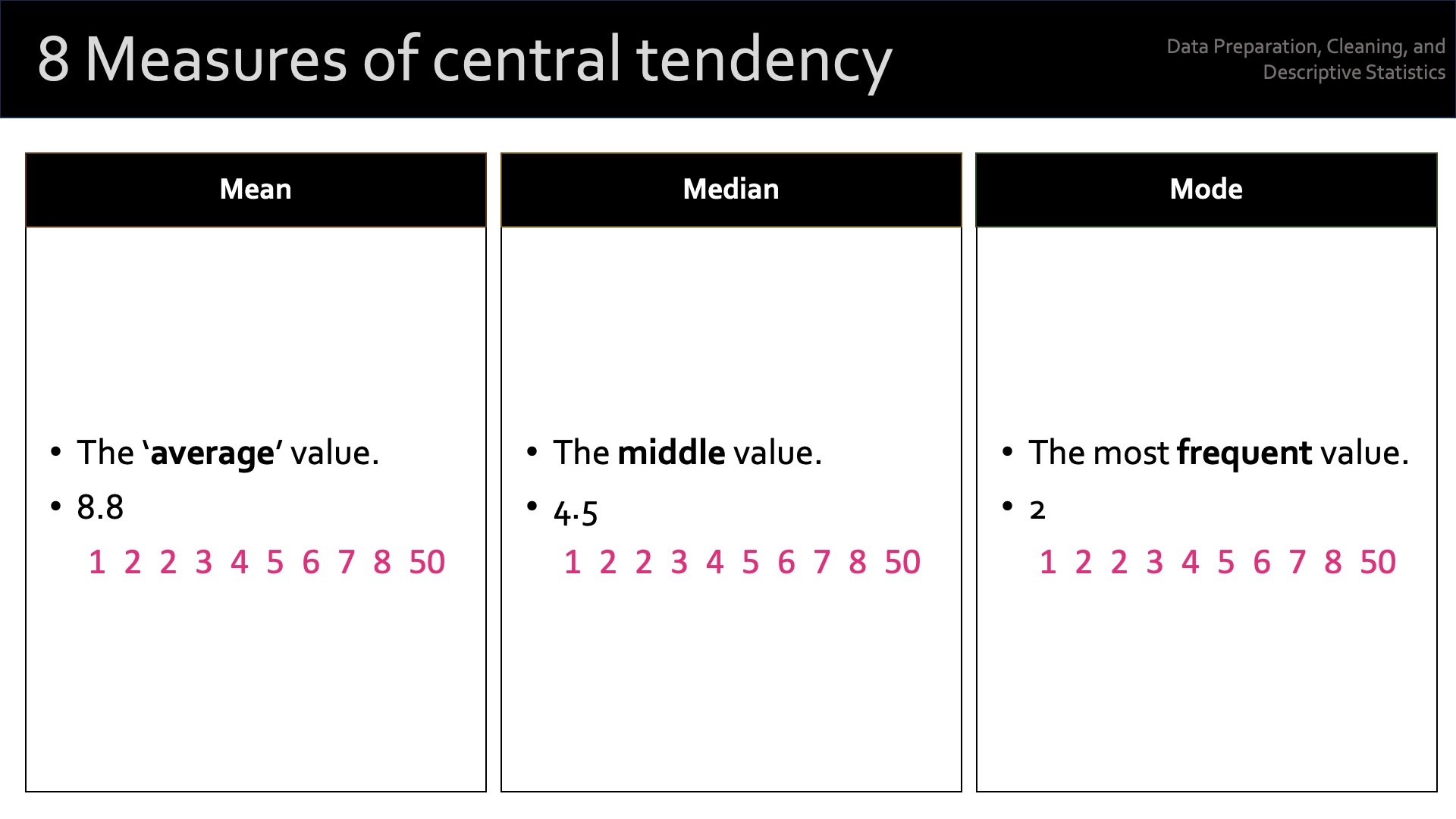
In statistics, ‘central tendency’ refers to the measure of the center or the “typical” value of a distribution. It’s a way to describe the location of the majority of the data points in a dataset.
Central tendency is often used to summarise and represent the entire dataset using a single value. There are three primary measures of central tendency:
Mean (Arithmetic mean): The mean is the sum of all the data points divided by the number of data points. It represents the average value of the dataset.
Median: The median is the middle value of the dataset when the data points are sorted in ascending or descending order. If there’s an even number of data points, the median is the average of the two middle values.
Mode: The mode is the most frequently occurring value in the dataset. A dataset can have no mode, one mode (unimodal), or multiple modes (bimodal, multimodal).
Each measure of central tendency has its strengths and weaknesses, and the choice of which one to use depends on the properties of the data and the purpose of the analysis.
For example, the mean is sensitive to extreme values (outliers), while the median is more robust to their presence. The mode is particularly useful for categorical data, where the mean and median are not applicable.
To calculate these in R we can use the following code (note the reference to BOTH the dataframe and the variable).
mean(our_new_dataset$Pts) # the mean (average)[1] 40.9median(our_new_dataset$Pts) # the median (middle)[1] 39table(our_new_dataset$Pts) # this shows the frequency of occurrence for each value
23 25 27 29 30 31 33 39 43 44 46 47 53 56 67 73
 1  1  2  1  2  1  1  2  1  1  1  1  1  2  1  1
15.4.2 Measures of Dispersion
In statistics, ‘measures of dispersion’ (also known as measures of variability or spread) quantify the extent to which data points in a distribution are spread out or dispersed. These measures tell you a lot about the variability, diversity, or heterogeneity1 of the dataset.
Some common measures of dispersion are:
Range: the difference between the maximum and minimum values in the dataset. It provides a basic understanding of the spread but is highly sensitive to outliers.
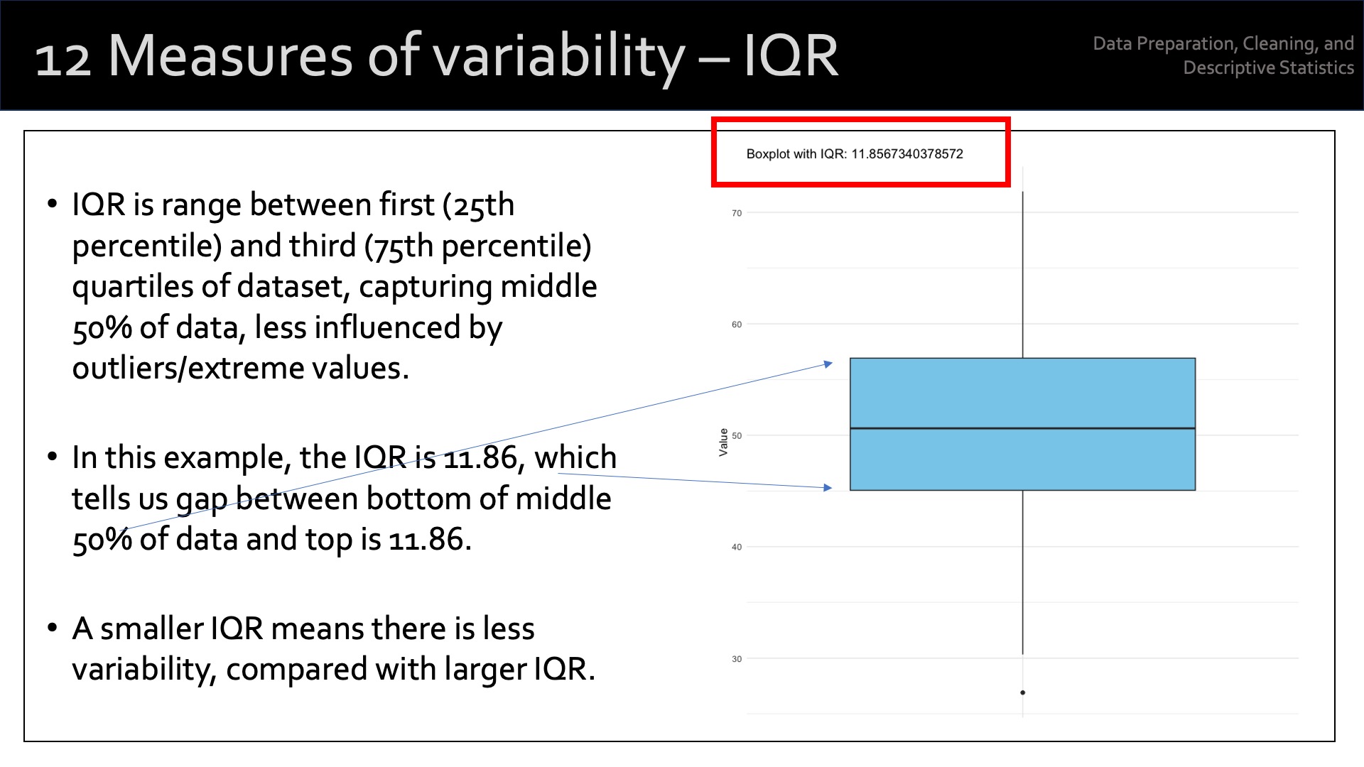
Interquartile Range (IQR): the difference between the first quartile (25th percentile) and the third quartile (75th percentile). It represents the spread of the middle 50% of the data and is more robust to outliers than the range.
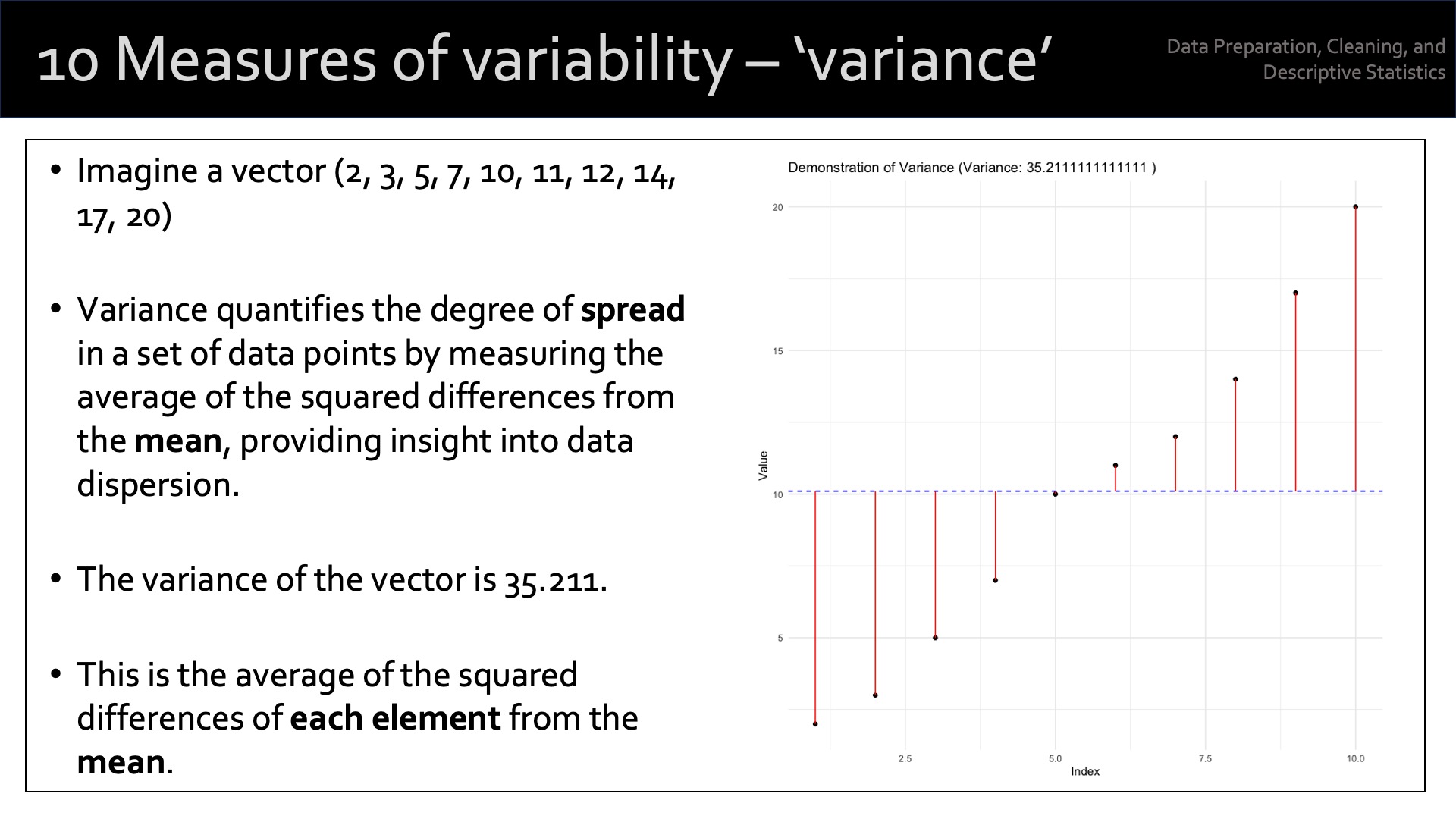
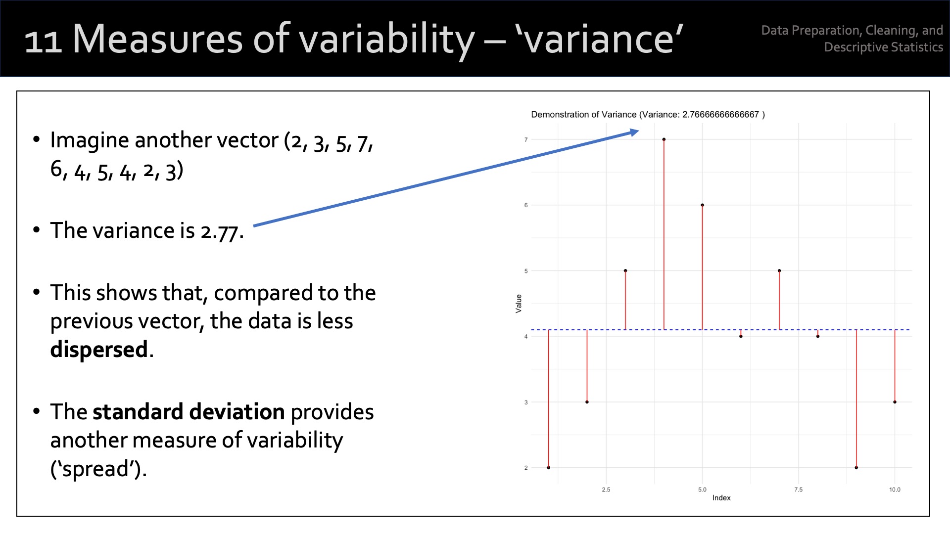
Variance: the average of the squared differences between each data point and the mean. It measures the overall dispersion of the data points around the mean. A larger variance indicates a greater degree of spread in the dataset.
Standard Deviation: the standard deviation is the square root of the variance. It’s expressed in the same units as the data, making it more interpretable than the variance. Like the variance, a larger standard deviation indicates a greater degree of spread in the dataset.
Mean Absolute Deviation (MAD): the average of the absolute differences between each data point and the mean. It provides a measure of dispersion that is less sensitive to outliers than the variance and standard deviation.
Coefficient of Variation (CV): the ratio of the standard deviation to the mean, expressed as a percentage. It provides a relative measure of dispersion, allowing for comparisons of variability between datasets with different units or scales.
Each measure of dispersion has its strengths and weaknesses, and the choice of which one to use depends on the properties of the data and the purpose of our analysis.
Combining measures of central tendency with measures of dispersion provides a more comprehensive understanding of the distribution and characteristics of the dataset.
The following code calculates some measures of dispersion for a variable in the dataset:
range(our_new_dataset$Pts)[1] 23 73var(our_new_dataset$Pts)[1] 205.1474sd(our_new_dataset$Pts)[1] 14.3229715.4.3 Measures of Shape
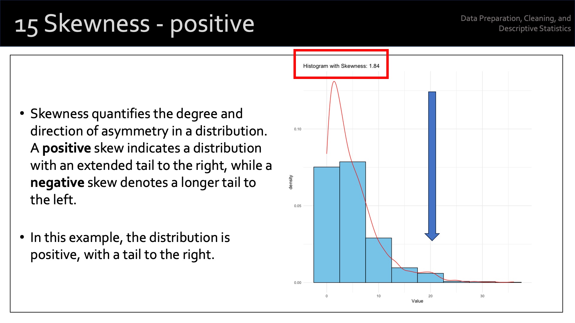
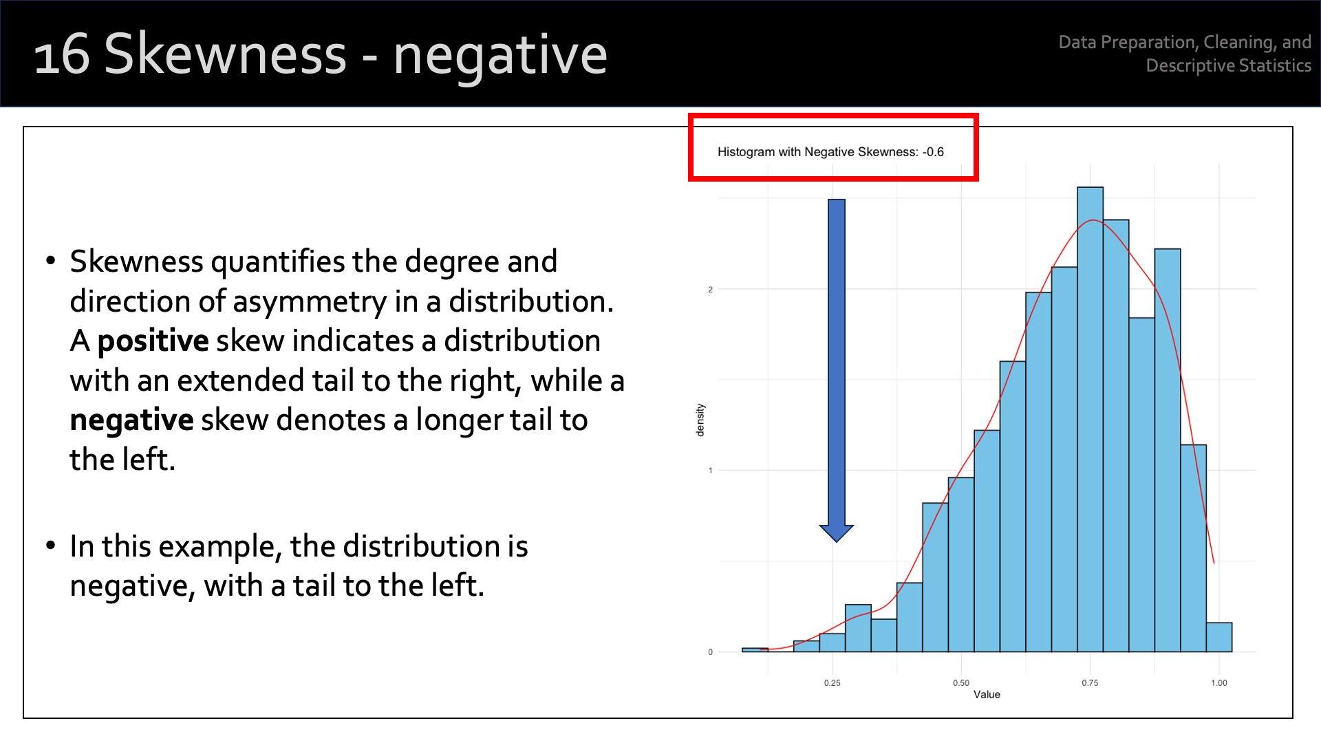
The term ‘measure of shape’ refers to the shape of the distribution of values of a particular variable. We use two measures of the shape of distribution: skewness and kurtosis. Each of these provide additional information about the asymmetry and the “tailedness” of a distribution beyond measures of central tendency and dispersion covered above.
15.4.3.1 Skewness
‘Skewness’ measures the degree of asymmetry of a distribution. A distribution can be symmetric, positively skewed, or negatively skewed.
- A symmetric distribution has a skewness of 0 and is evenly balanced on both sides of the mean.
- A positively skewed distribution has a long tail on the right side, indicating that there are more data points with values larger than the mean.
- A negatively skewed distribution has a long tail on the left side, indicating that there are more data points with values smaller than the mean.
The term ‘positive skewness’ describes skewness > 0. ‘Negative skewness’ describes skewness < 0. The term ‘symmetric distribution’ describes skewness ~ 0.
# load the 'moments' library, which provides these outputs

library(moments)  # remember to install this if required

# calculate the skewness of variable 'Pts'
skewness(our_new_dataset$Pts)
[1] 0.7173343This suggests a positive skewness for [Pts] of 0.72.
The commands qqnorm and qqline can be very useful to visualise skewness in the data:
qqnorm(our_new_dataset$Pts)
qqline(our_new_dataset$Pts)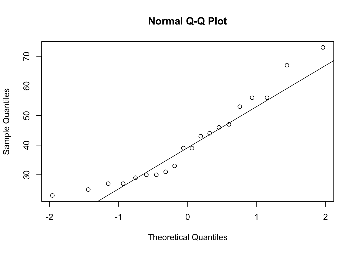
15.4.3.2 Kurtosis
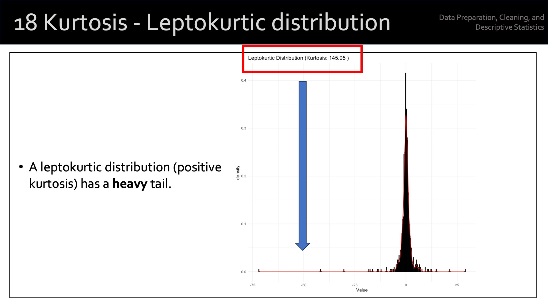
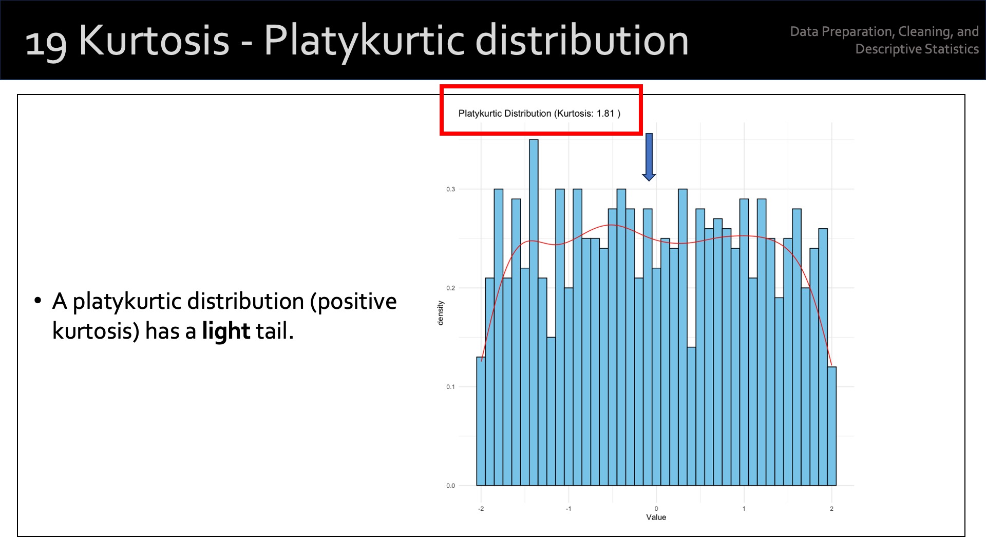
Kurtosis measures the “tailedness” or the concentration of data points in the tails of a distribution relative to a normal distribution. It indicates how outlier-prone a distribution is. A distribution can have low kurtosis (platykurtic), high kurtosis (leptokurtic), or be mesokurtic (similar to a normal distribution).
Platykurtic: A distribution with low kurtosis has thinner tails and a lower peak than a normal distribution, implying fewer extreme values (outliers). Kurtosis < 3.
Leptokurtic: A distribution with high kurtosis has fatter tails and a higher peak than a normal distribution, implying more extreme values (outliers). Kurtosis > 3.
Mesokurtic: A distribution with kurtosis similar to a normal distribution. Kurtosis ~ 3.
Kurtosis is not a direct measure of the peak’s height, but rather the concentration of data points in the tails relative to a normal distribution.
# load the 'moments' library
library(moments)

# calculate the kurtosis of variable 'Pts'
kurtosis(our_new_dataset$Pts)
[1] 2.57545615.5 Data Visualisation
We’ve covered some basic descriptive statistics that should be conducted on all appropriate variables in the dataset.
We can then move on to some visual explorations of the data.
Remember, at this point in the process, I’m just exploring the data. Specific analysis will come later.
15.5.1 Univariate Analysis
15.5.1.1 Histogram
A histogram is a commonly used way of plotting the frequency distribution of single variables. Use the following command to create a histogram:
hist(our_new_dataset$Pts, col = "blue", main = "Histogram")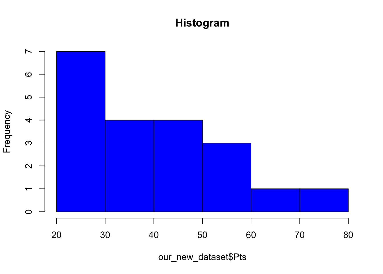
15.5.1.2 Box Plot
Box plots are also useful in visualising individual variables:
boxplot(our_new_dataset$Pts, col = "red", main = "Box Plot", xlab="Points")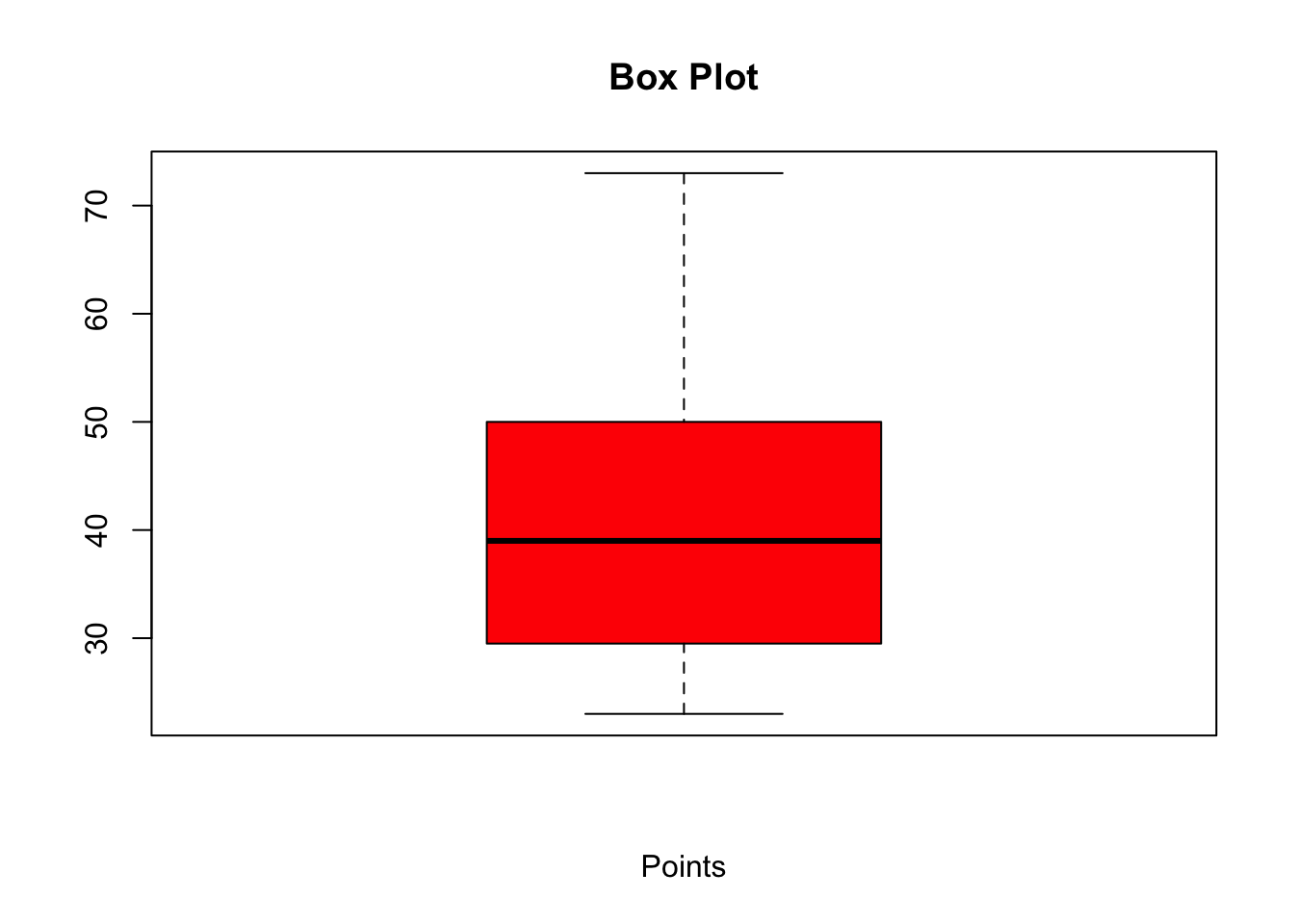
15.5.1.3 Density Plot
A density plot (also known as a kernel density plot or kernel density estimation (KDE) plot) is a graphical representation of the distribution of a continuous variable.
It’s a smoothed, continuous version of a histogram that displays an estimate of the probability density function of the underlying data.
A density plot is created by using a kernel function, which is a smooth, continuous function (typically Gaussian2), to estimate the probability density at each point in the data.
The kernel functions are centered at each data point and then summed to create the overall density plot.
The smoothness of the plot is controlled by a parameter called ‘bandwidth’; a larger bandwidth results in a smoother plot, while a smaller bandwidth results in a more detailed plot.
Density plots are useful for visualising the distribution of continuous data, identifying the central tendency, dispersion, and the presence of multiple modes or potential outliers.
They’re particularly helpful if we want to compare the distributions of multiple groups or variables, as they allow for a clearer visual comparison than overlapping histograms.
# plot the density of the 'Pts' variable in the dataset
library(ggplot2)

# Create a density plot
ggplot(our_new_dataset, aes(x=Pts)) +
  geom_density(fill="blue", alpha=0.5) +
  theme_minimal() +
  labs(title="Density Plot for Pts", x="Pts", y="Density")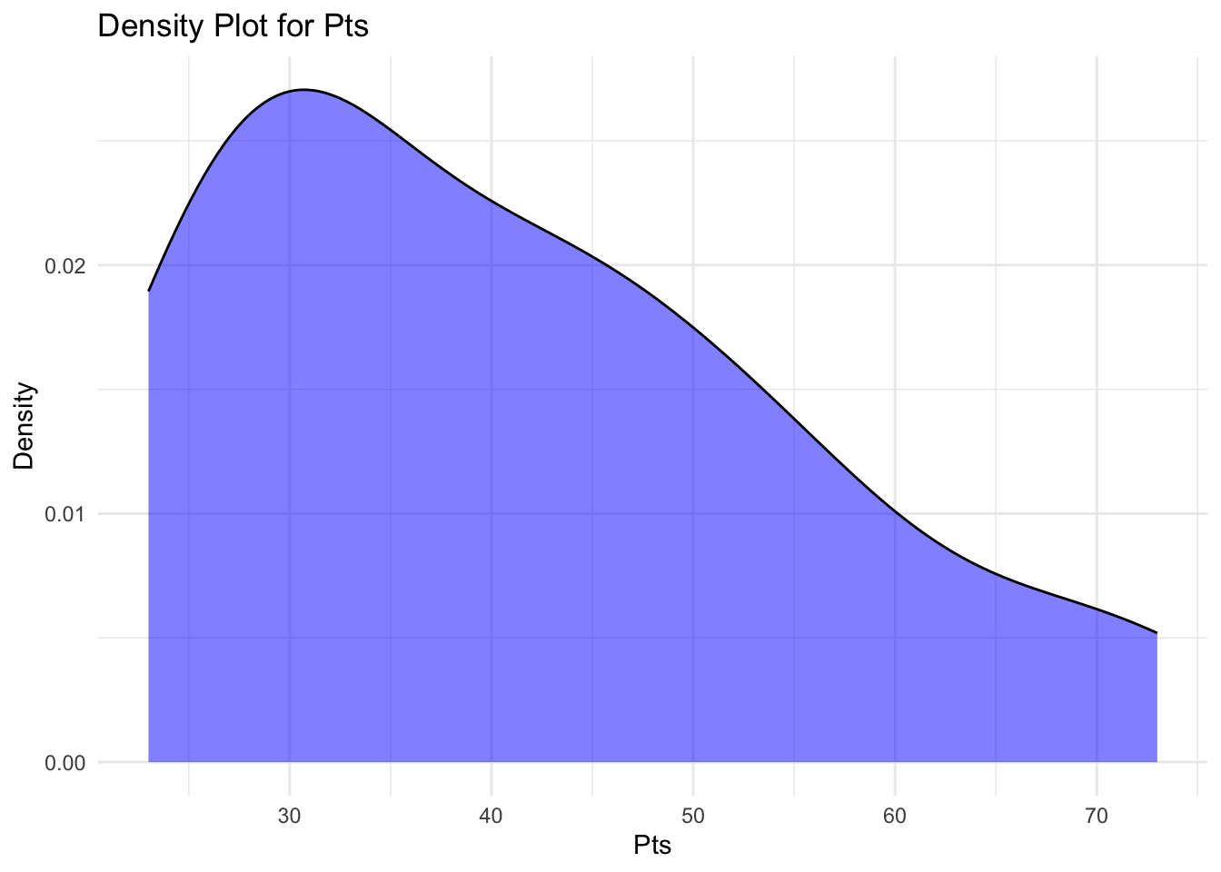
15.5.2 Bivariate Analysis
Bivariate analysis describes the exploration of the relationship between two variables. The following techniques are useful in exploring such relationships:
15.5.2.1 Scatter Plot
A scatter plot allows us to visually explore the relationship between two variables. For example, we may be interested in the association between number of drawn games and current league position.
plot(our_new_dataset$Pos, our_new_dataset$D, main = "Scatter Plot")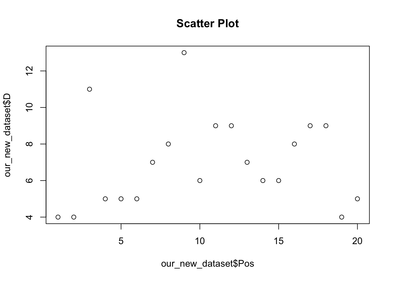
As we learned in earlier in the module, more sophisticated figures can be produced using the ggplot2 package, which also allows us to include a linear regression line:
ggplot(our_new_dataset, aes(x = Pos, y = D)) +
geom_point() +
labs(title = "Scatter Plot", x = "League position", y = "Drawn games (n)") +
geom_smooth(method='lm') +
theme_test()
`geom_smooth()` using formula = 'y ~ x'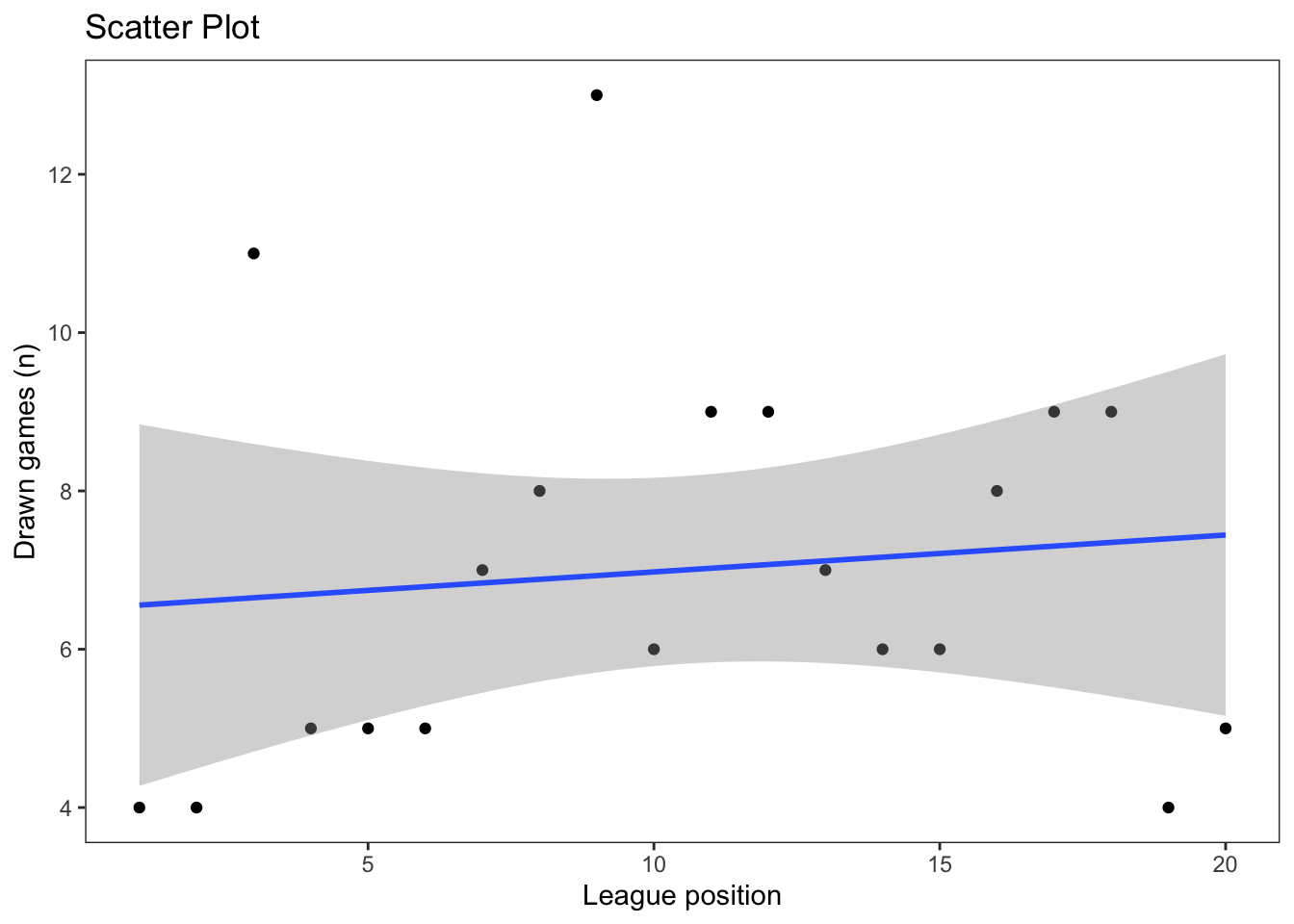
15.5.2.2 Correlation
Correlation allows us to quantify the relationship between two variables. While a visual association is interesting, we need to know whether it is actually meaningful.
The following code calculates the relationship between league position and goal difference:
cor(our_new_dataset$Pos, our_new_dataset$GD)[1] -0.9068453This command, in R, doesn’t give you any additional information about the correlation, for example its significance (unlike packages such as SPSS or STATA).
Thankfully, there are a number of different packages that produce this. For example:
library(rstatix)
Attaching package: 'rstatix'The following object is masked from 'package:stats':
filter# the rstatix package gives us the p-value, CI and correlation coefficient
result <- our_new_dataset %>% cor_test(Pos, GD)
print(result)# A tibble: 1 × 8
var1 var2 cor statistic p conf.low conf.high method
<chr> <chr> <dbl> <dbl> <dbl> <dbl> <dbl> <chr>
1 Pos GD -0.91 -9.13 0.0000000356 -0.963 -0.776 Pearson15.5.2.3 Heatmap
A heatmap is another compelling visual presentation of the relationship between variables:
library(ggplot2) # load ggplot2 library

ggplot(our_new_dataset, aes(Pos, W)) + geom_tile(aes(fill = GD)) +
scale_fill_gradient(low = "white", high = "blue") # create a heatmap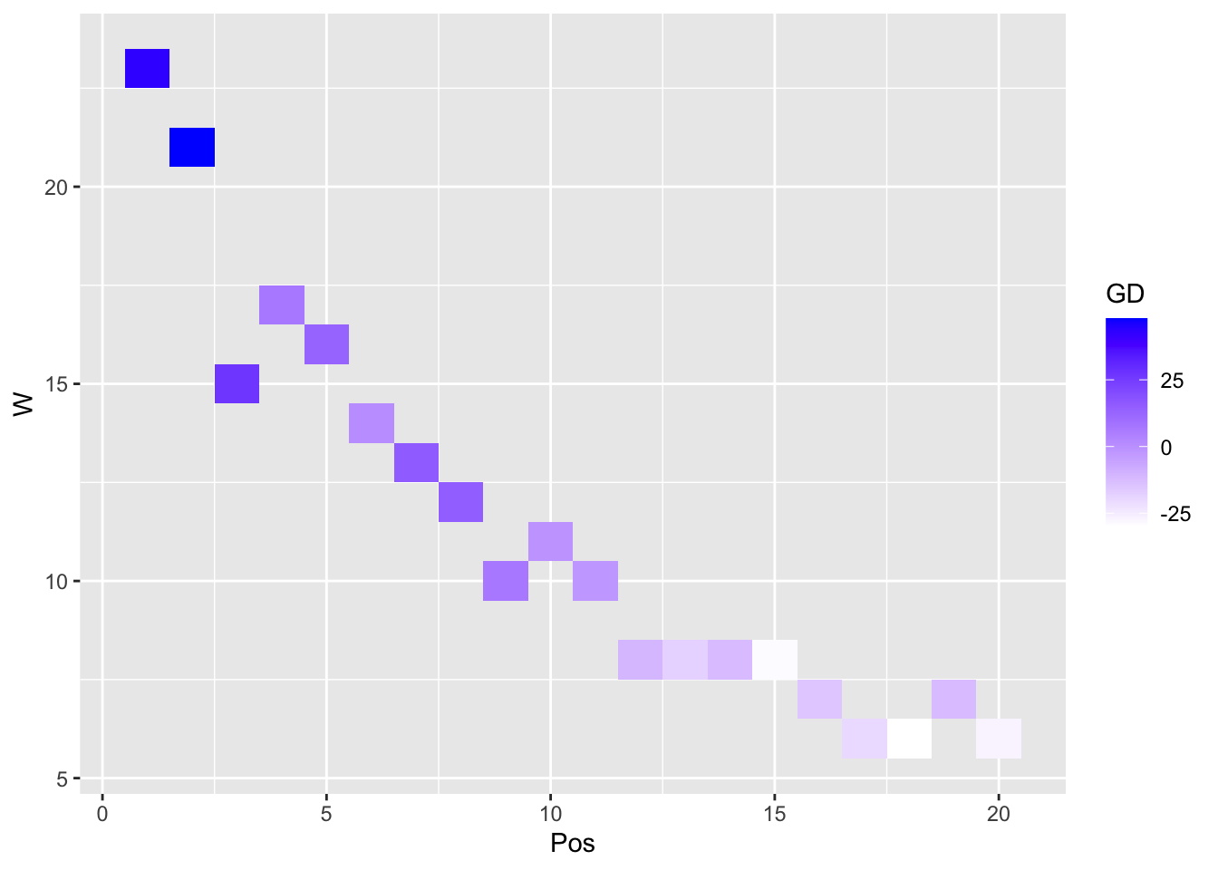
15.5.3 Multivariate Analysis
15.5.3.1 Pairwise scatter plots
The previous techniques deal with one variable (univariate) and two variables (bivariate). You may also wish to explore the relationships between multiple variables in your dataset (multivariate).
Note that, to do this, you need to remove any non-numeric variables in your dataset.
# remove non-numeric variables from our_new_dataset and create a new dataset our_new_dataset_02

our_new_dataset_02 <- our_new_dataset[sapply(our_new_dataset, is.numeric)]

pairs(our_new_dataset_02)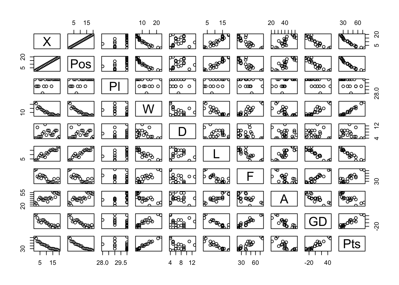
15.5.3.2 Parallel coordinate plot
library(MASS)
Attaching package: 'MASS'The following object is masked from 'package:rstatix':
selectparcoord(our_new_dataset_02, col = 1:nrow(our_new_dataset_02))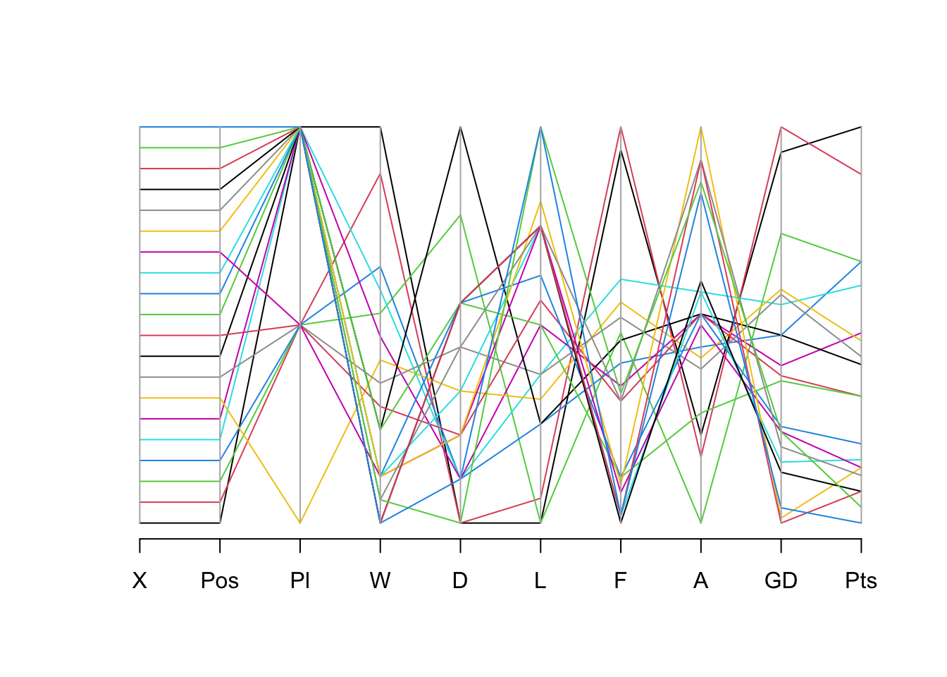
15.6 EDA Techniques for Categorical Data
The techniques outlined above are appropriate for variables that are measured using interval, ratio, or scale measurements. However, it is likely that you will also encounter variables that are measured using categorical (nominal) or ordinal formats.
Some EDA techniques for dealing with this kind of data are described below.
15.6.1 Frequency Tables
It is useful to explore the frequency with which each variable occurred. In R, we can use the table command (which works on all types of variable):
table(our_new_dataset$D)
 4  5  6  7  8  9 11 13
 3  4  3  2  2  4  1  1
15.6.2 Bar plots
Bar plots are a useful way of visualisation frequency data.
In the following example, we can explore the frequency of occurrence of the total number of draws by team. We can immediately see that 5 and 9 were the most frequently achieved number draws (i.e. 4 teams achieved 5 draws, and 4 teams achieved 9 draws).
barplot(table(our_new_dataset$D), main = "Bar Plot of Number of Draws",
col = "green", xlab = "Frequency", ylab = "Draws (n) for each team")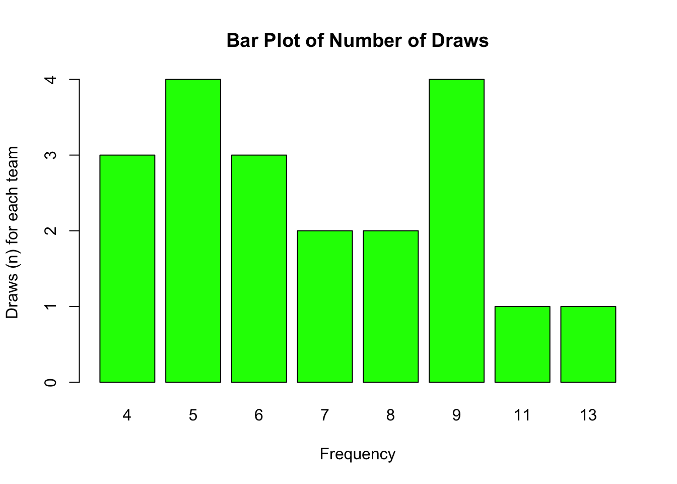
15.6.3 Pie charts
pie(table(our_new_dataset$D), main = "Pie Chart", col = rainbow(length(table(our_new_dataset$D))))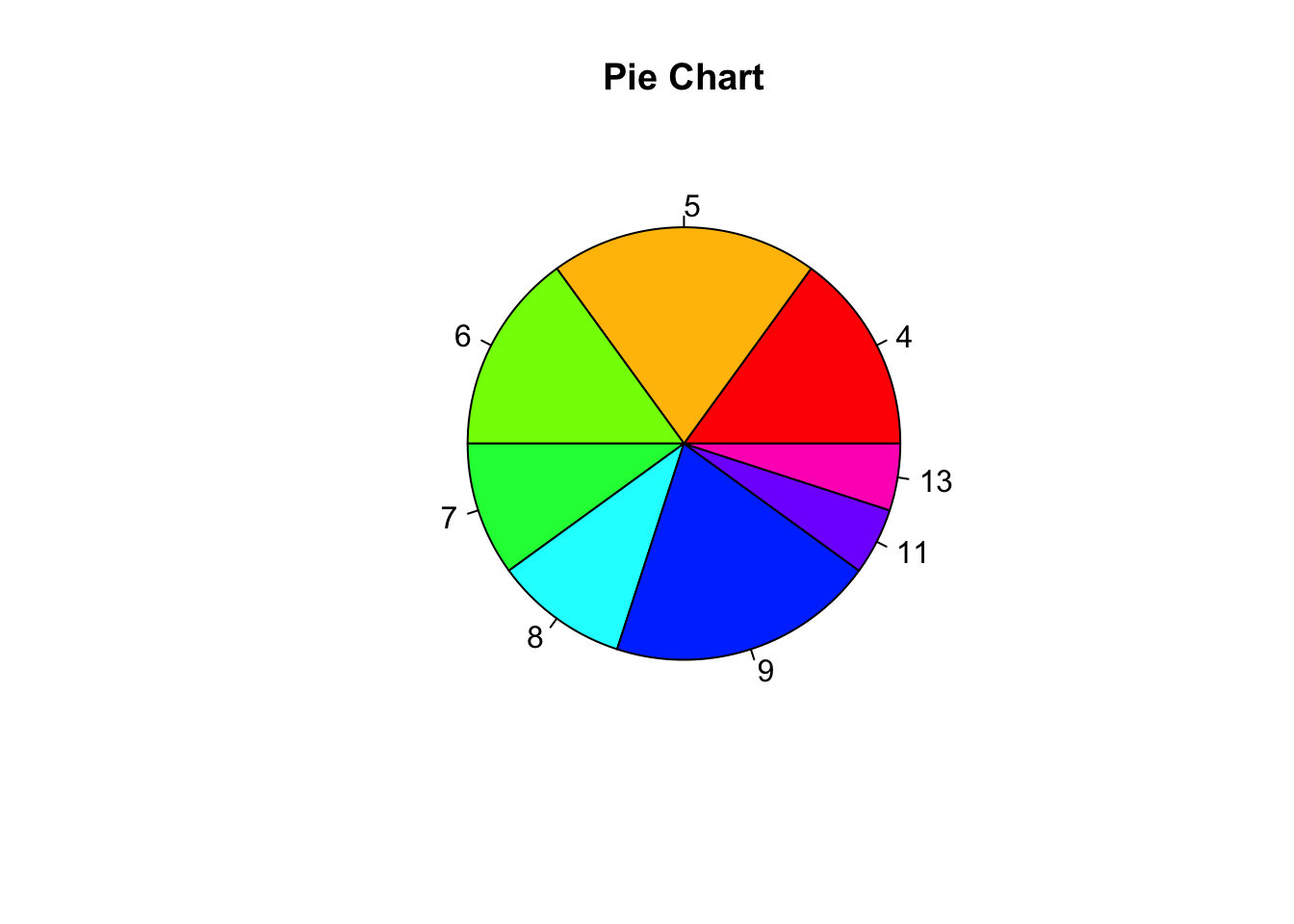
15.6.4 Mosaic Plots
A mosaic plot is a graphical representation of the distribution of a categorical variable, or the relationship between multiple categorical variables, where the area of each segment is proportional to the quantity it represents.
They’re often used to visualise contingency table data.
library(vcd)Loading required package: gridmosaic(~ GD + D, data = our_new_dataset)
15.6.5 Stacked bar plots
A stacked bar plot in R is a bar chart that breaks down and compares parts of a whole. Each vertical bar in the chart represents a whole (for example a league), and segments in the bar represent different parts or categories of that whole.
# Load ggplot2 library

library(ggplot2)

# Create data frame
df <- data.frame(

 finish = c("Top", "Middle", "Bottom", "Top", "Middle", "Bottom",
 "Top", "Middle", "Bottom"),
 league = c("League1", "League1", "League1", "League2",
 "League2", "League2", "League3", "League3", "League3"),
 points = c(12, 10, 8, 15, 10, 7, 18, 12, 4)
)

# Create stacked bar plot
ggplot(df, aes(fill=finish, y=points, x=league)) +
geom_bar(position="stack", stat="identity") +
labs(title="Stacked Bar Plot", x="league", y="points")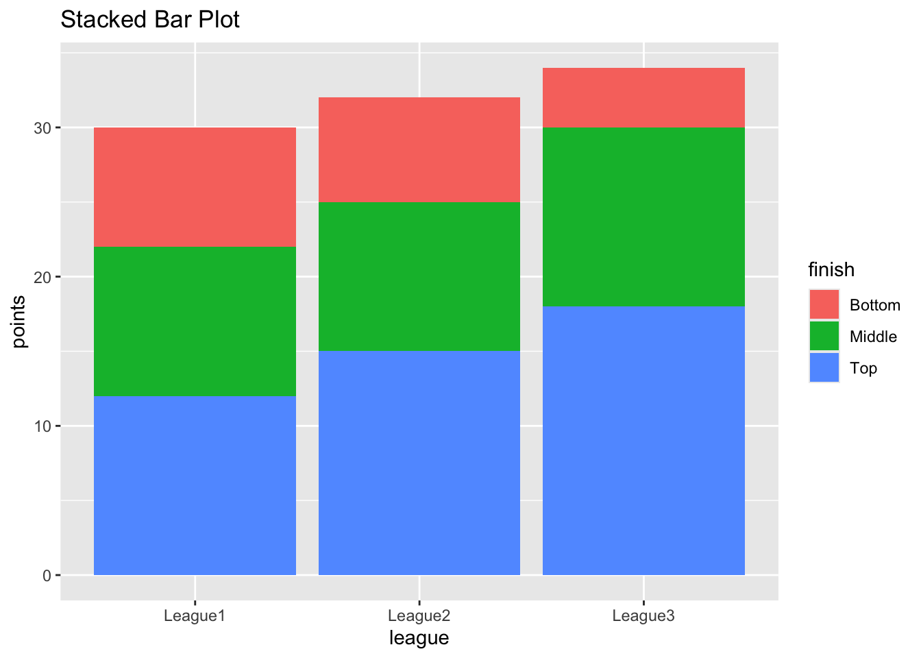
In this example, I created a data frame with three groups (leagues) and three categories in each group (finishing position). Each row also contains the number of points the team achieved.
I passed this data to the ggplot function. The ‘fill=category’ argument colours the bar segments based on the category, ‘y=points’ defines the heights of the segments, and x=league defines the x-axis values.
The geom_bar function with position=“stack” and stat=“identity” arguments create the stacked bar plot.
The resulting plot will show three bars (one for each league) with each bar divided into segments (for final position). The height of each segment corresponds to its points achieved.